The Challenge
A spinal condition can impact your day-to-day life in a myriad of painful and debilitating ways. Specialist Spine Surgeon Dr Laurence McEntee has a passion for helping patients get the most out of life. Our mission was to cement Dr Laurence McEntee at the top of this field with a visual brand identity that oozes confidence and professionalism as much as charm and warmth.
The Idea
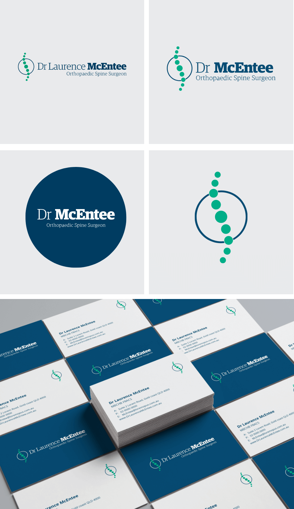
We trust surgeons with our lives. This is a huge responsibility that prompts us to look for professionals who embody authority, trust, professionalism and knowledge. Globally healthcare is one of the largest industries, a strong visual identity applies to the whole sector with the 85% of healthcare providers using blue in their visual identities. This choice makes perfect sense when we consider what customers associate with the colour blue: authority, trust, professionalism and knowledge. Green comes in second with 41% followed by White 36%. This initial research formed the basis for Dr McEntee’s new visual brand identity.
Once a colour palette was established we needed a strong visual icon to set Dr McEntee apart from other healthcare providers. We created the spinal device by mapping the curves of the human spine and then simplified this into ten circles with the tenth forming a target area around the spine. We paired this with a strong distinctive typeface to achieve an identity that communicates; confidence, professionalism, charm and warmth.
The Results
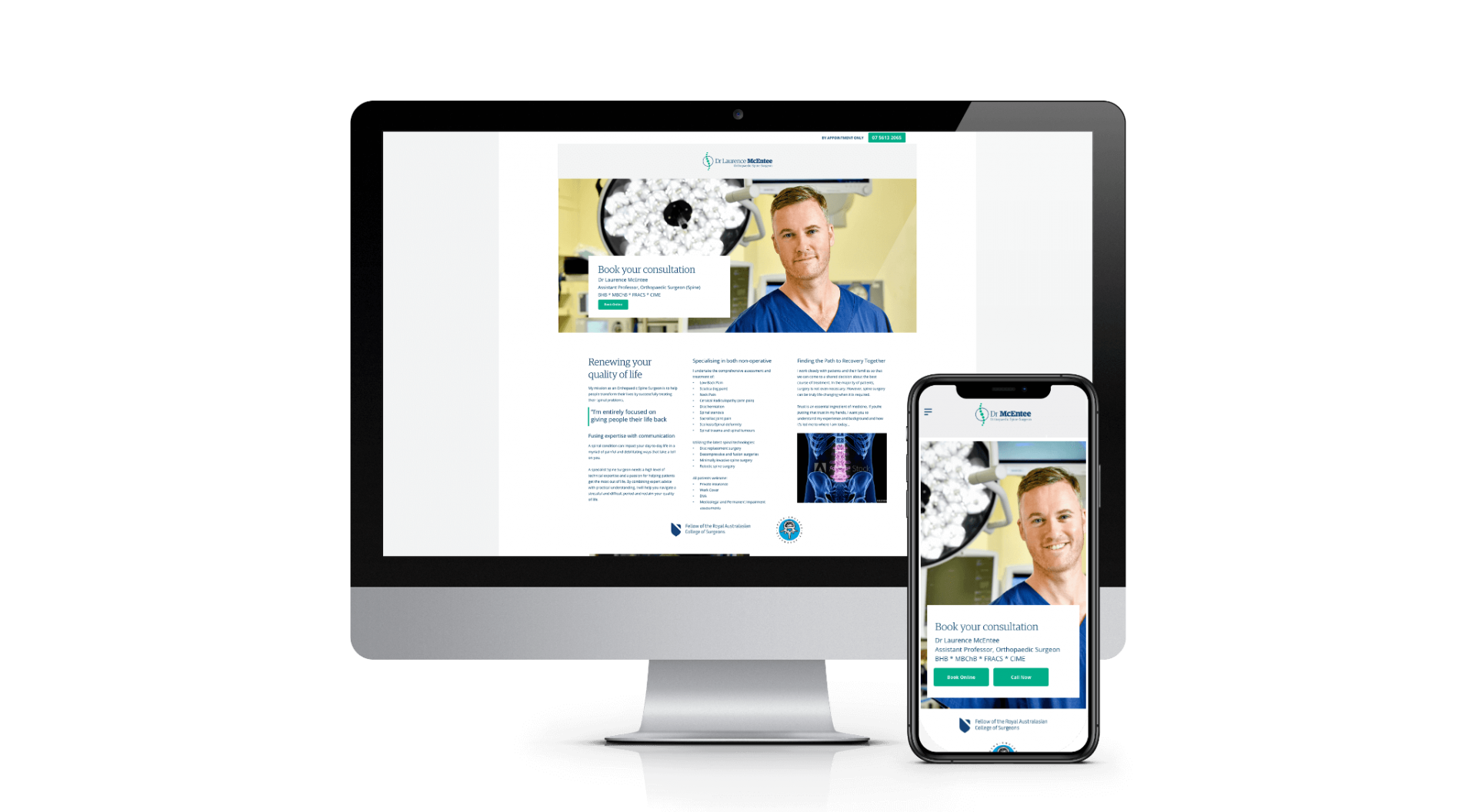
A dynamic brand identity designed to reflect Dr McEntee values, and position the surgery at the top of the industry.