Liverpool Neighbourhood Connections
A fresh identity.
The same heart for community.
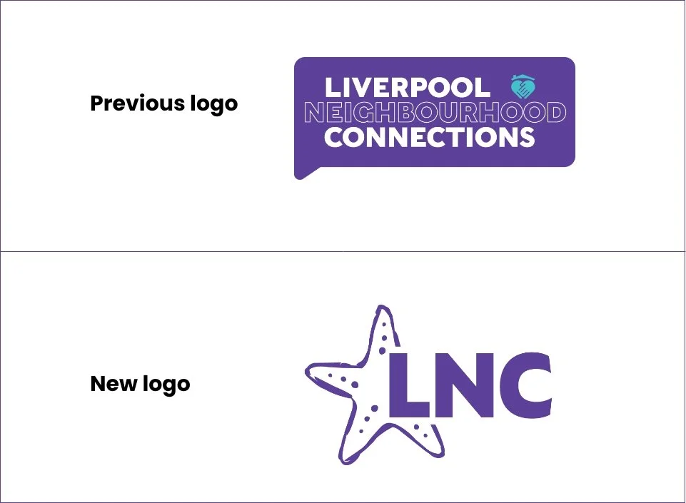
Bringing a community organisation's purpose to life through a contemporary brand identity.
The Challenge
Liverpool Neighbourhood Connections (LNC) plays an important role in bringing people together, supporting local families and strengthening its community. The challenge was to refresh its visual identity to better reflect the organisation today, creating a more contemporary and engaging brand without losing the warmth, personality and community spirit at its heart.
The Creative Approach
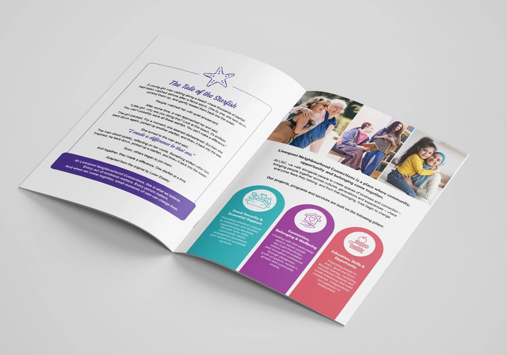
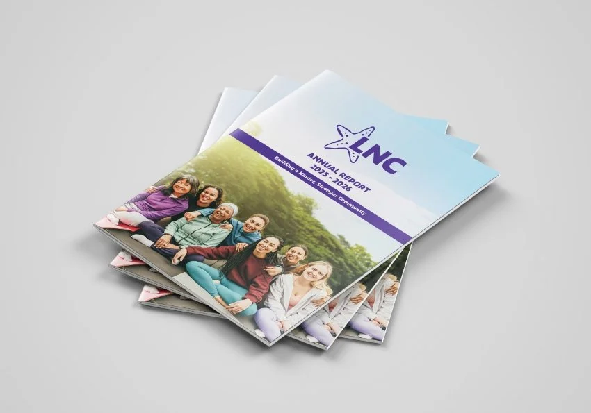
We set out to create an identity that felt fresh, approachable and full of meaning. The starfish became the centrepiece of the rebrand, inspired by the familiar starfish story and its powerful message: that even the smallest actions can make a meaningful difference.
More than just a visual symbol, the starfish gave LNC a distinctive brand asset and a story that reflects its belief in the power of individual connections to create stronger communities.
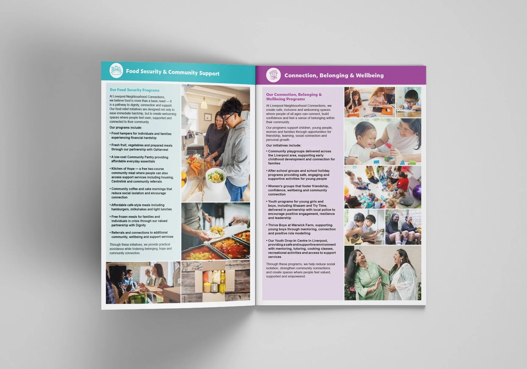
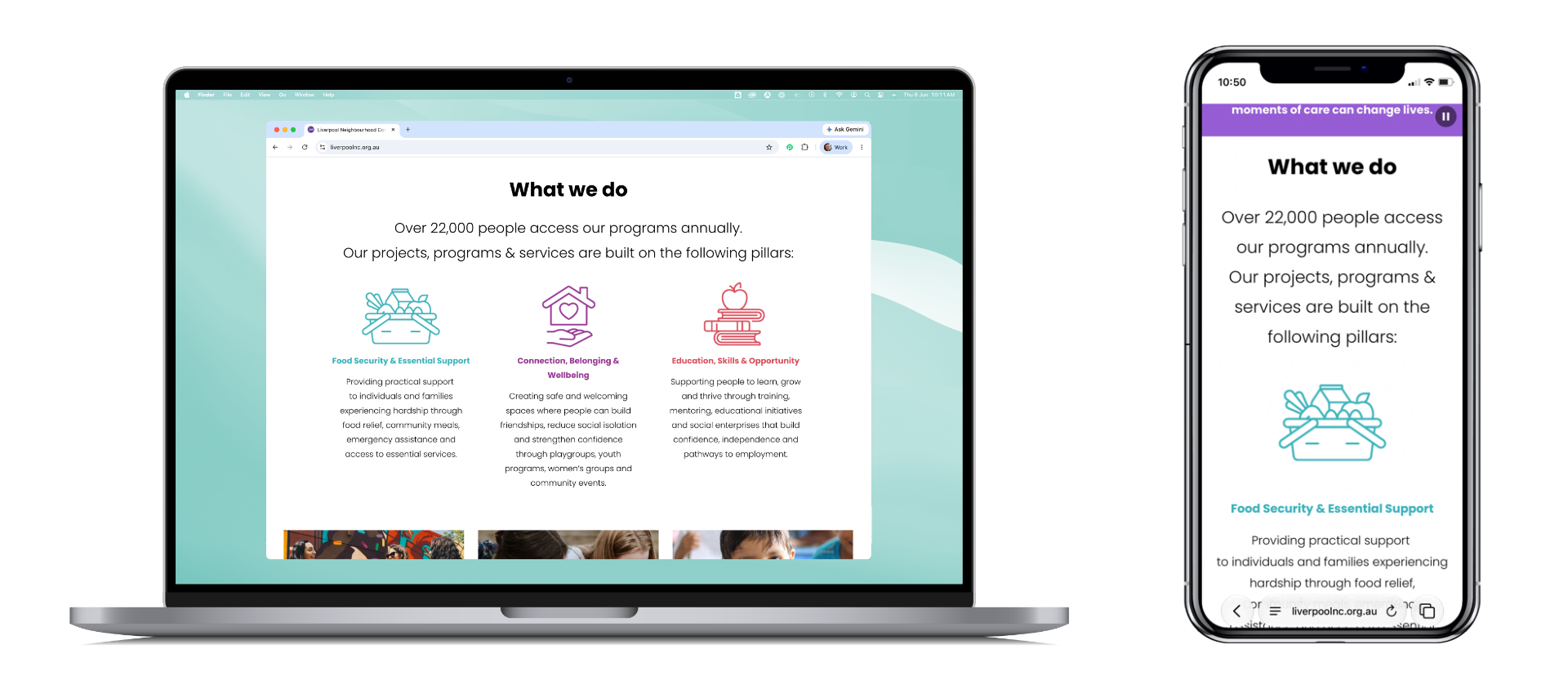
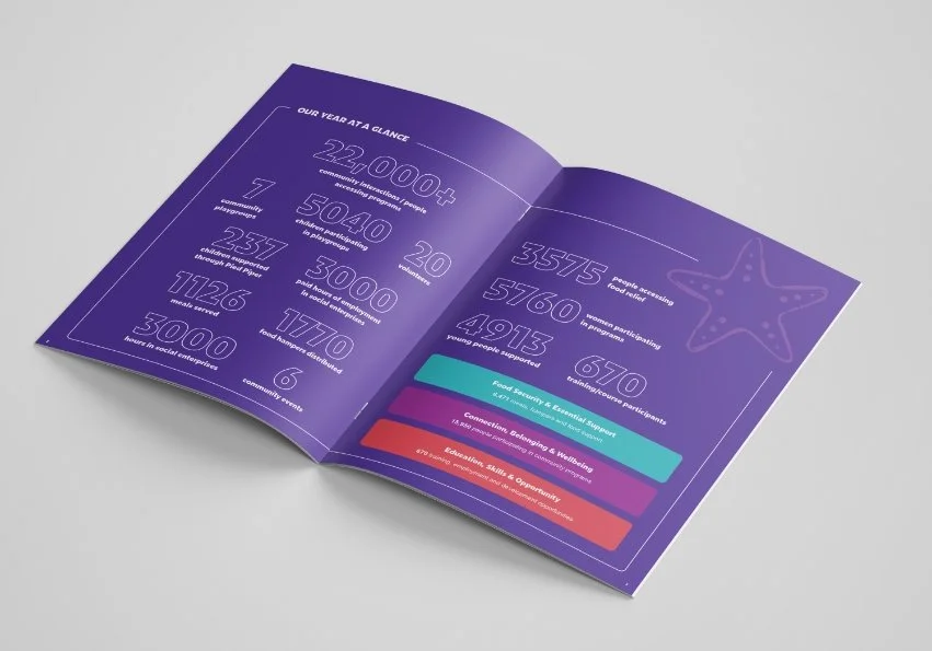
We also developed three key brand pillars to give greater meaning and structure to LNC's purpose. These pillars translate what the organisation stands for into clear, accessible messages, helping communicate its impact and create a consistent narrative across every touchpoint.
Bringing the Brand to Life
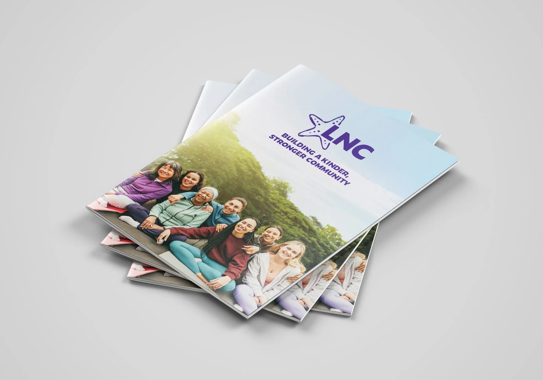
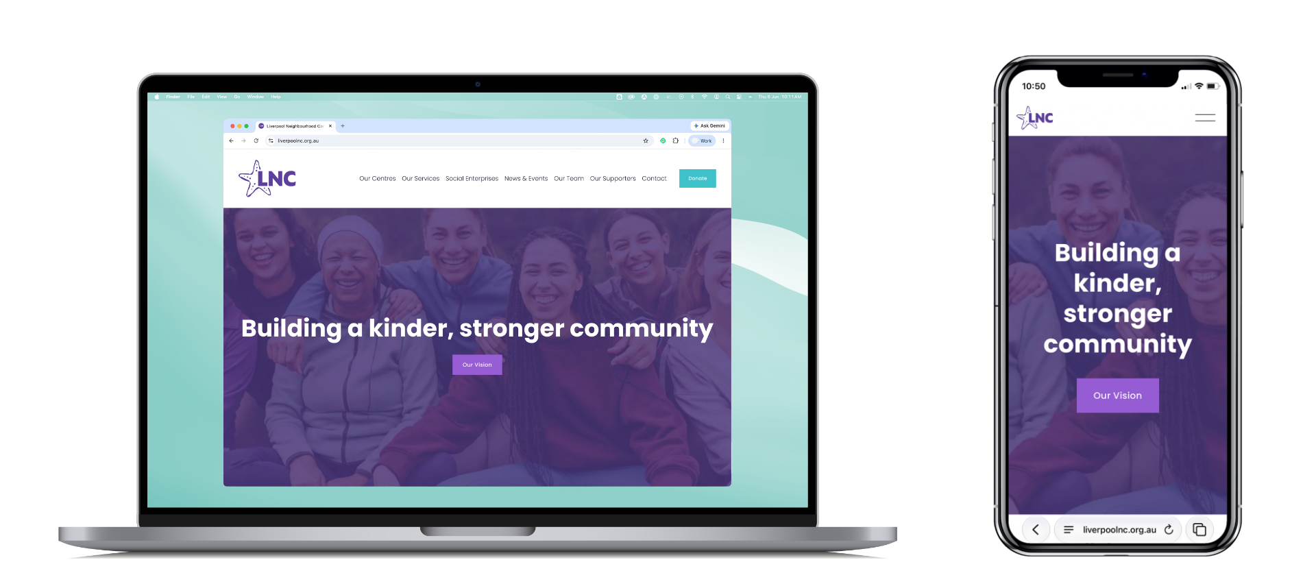
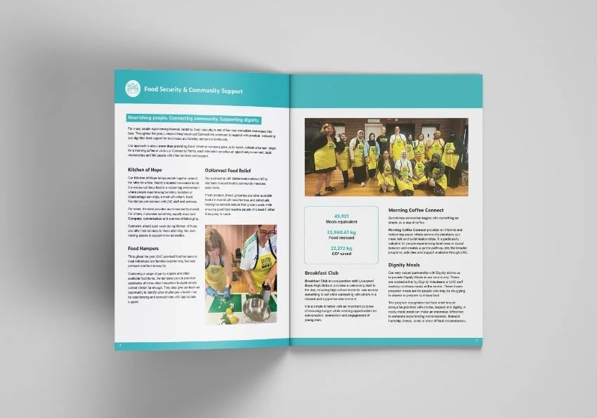
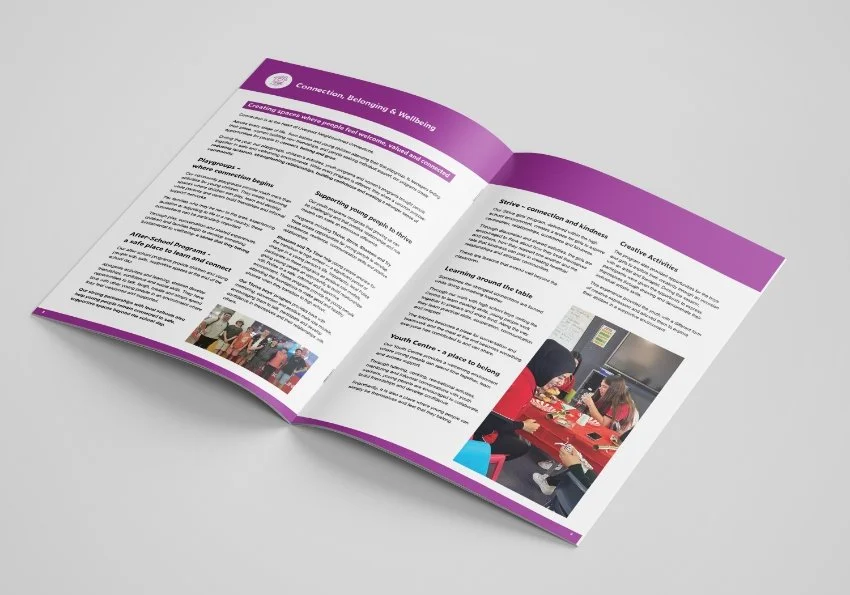
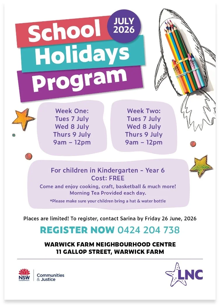
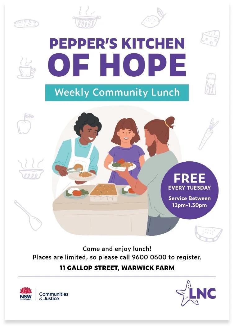
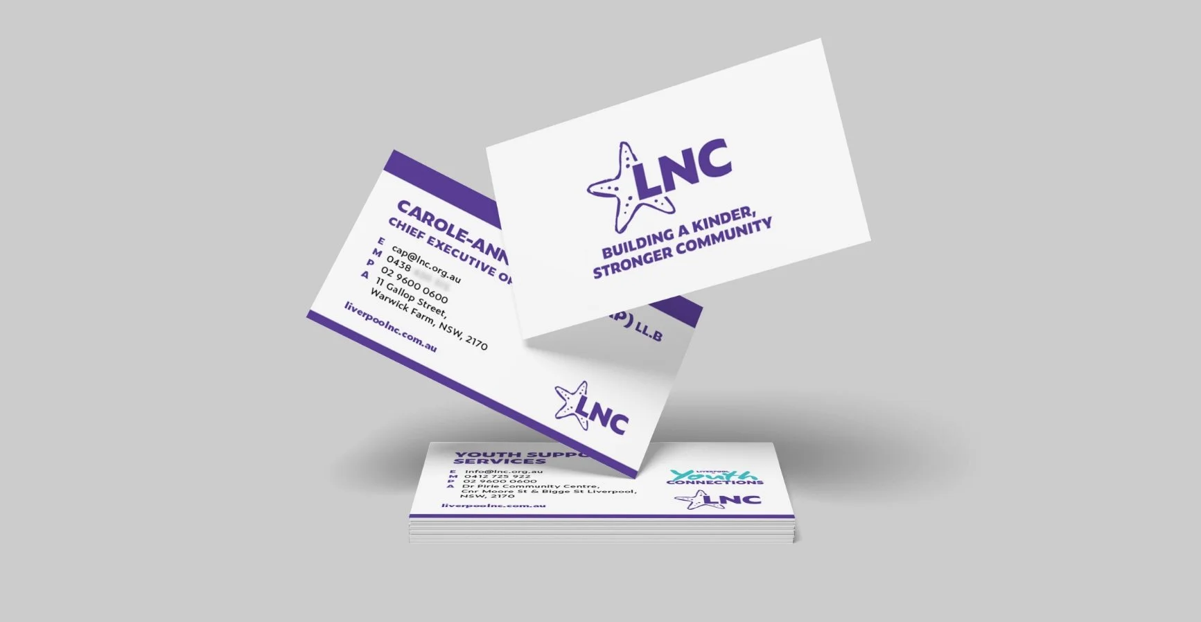
From the refreshed logo and colour palette to stationery, brochures, program collateral and a redesigned digital experience, we rolled out a cohesive identity across print and digital channels.
The result is a more contemporary, recognisable and unified brand that feels true to LNC's values, making its work more visible, its purpose more meaningful and its community connections even stronger.
A new look, with the same heart.