The Challenge
Led by long-time CEO Pat Hall, the passionate LNC team is dedicated to helping people in the Liverpool catchment area create lasting generational change.
However, their incredible work was getting lost. In contrast to their multifaceted work, their brand identity was rudimentary and one-dimensional. Fundamental information wasn’t easily accessible on the website, which was clunky and uninteresting.
The charity sector in Australia is competitive. The headmark creative team joined forces with the LNC team to take charge and create a new brand identity which matched the real-life energy of the organisation.
The Idea
headmark’s creatives travelled to the LNC headquarters in Warwick Farm to meet the team and get a feel for the people behind the name. It was an indispensable part of the creative work, as we heard stories of change and witnessed first-hand the growth that LNC programs foster.
After this discovery session, we got to work reshaping the brand. Our Creative Copywriter devised a strong, community-based tone of voice that would also translate well visually. The ‘Together, We’re Strong’ tagline was chosen as the lead, and we audited the website copy to be more dynamic and concise.
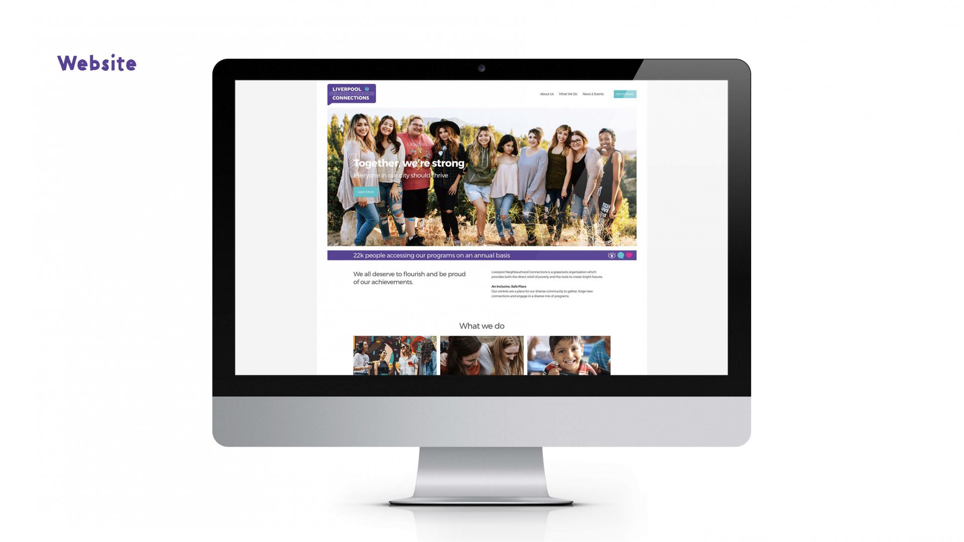
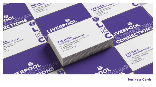
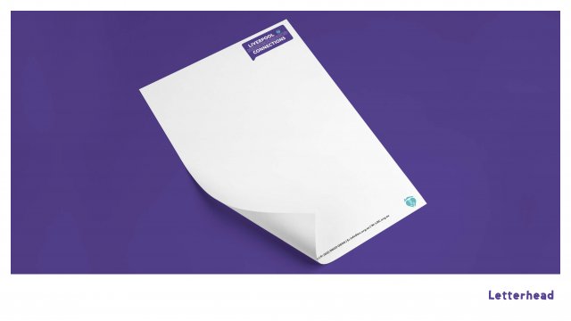
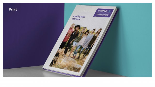
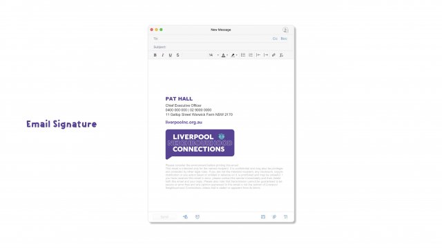
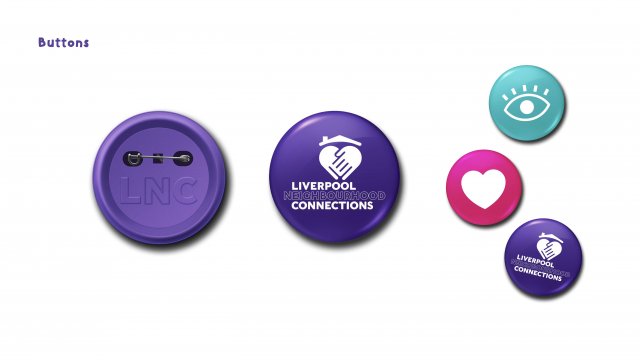
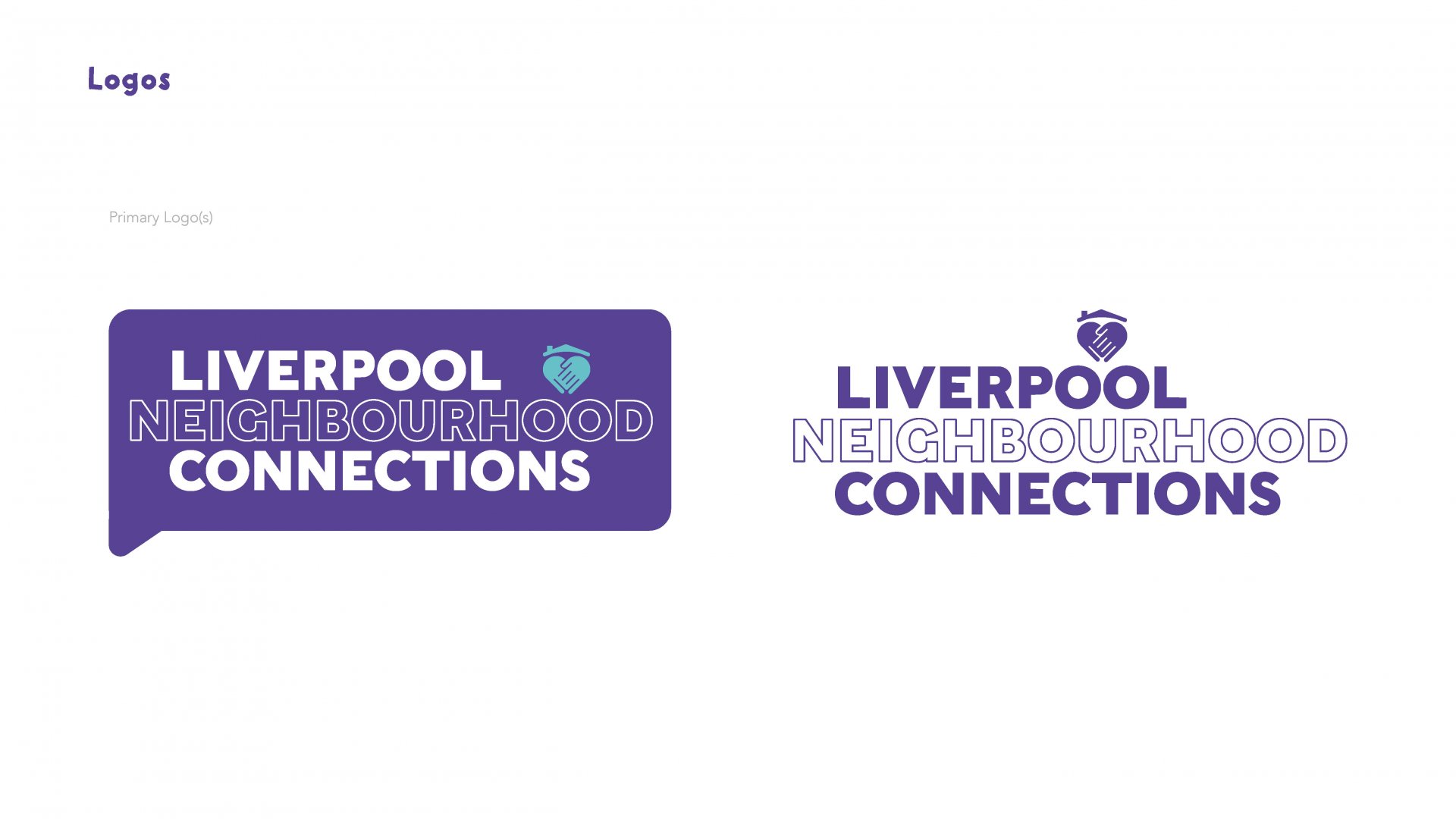
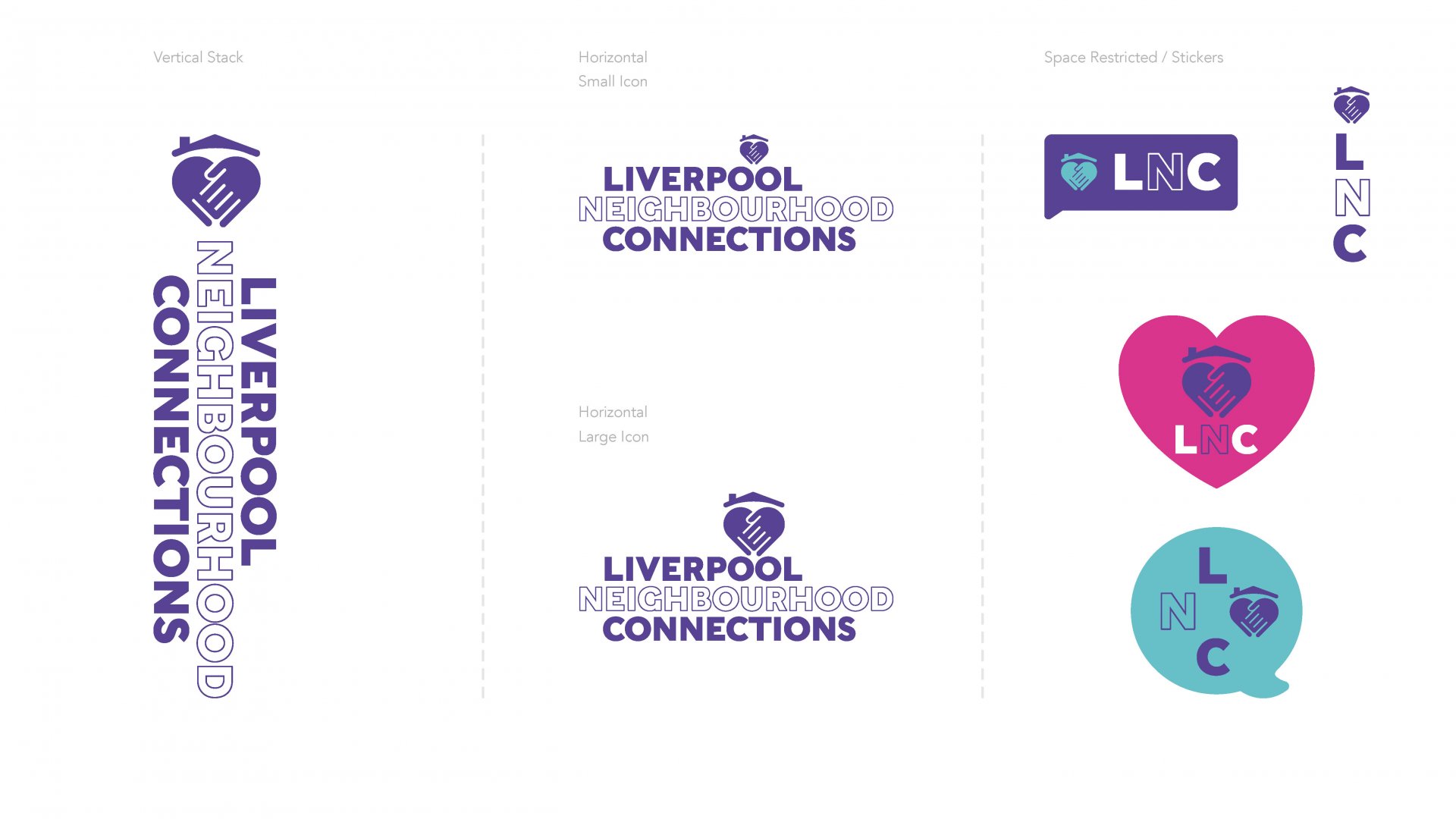
Our designers redeveloped the logo, making it strong and modern. A vibrant colour palette was rolled out across all assets, while the entire website was redesigned to be clean and easy to navigate, with imagery that reflected LNC.
We incorporated real statistics and results across the website, to show visitors the tangible change that is being wrought in Liverpool. Our designers also made fundamental additions, like a ‘Donate’ button in a prominent spot to attract website visitors.
The Results
The LNC team are thrilled with the results. They now have a strong, confident brand identity which helps define them much more clearly to the community and prospective donors.
The website is packed with concise, accurate information written in a lively manner, much easier to navigate and visually appealing. The team can now send people directly to landing pages to promote interest in specific programs. The new ‘Donate’ button has also helped drive more revenue.
Most importantly, the LNC are proud of their refreshed brand identity, which is more reflective of the positive energy they bring to work everyday.
Headmark is a Sydney-based digital and creative agency that solves problems for brands so that they can experience real growth.
Love to chat about what we can do for you? Get in touch with us today.